15.1: Notice and Wonder: Two Parties
Here are two dot plots including the mean marked with a triangle. Each shows the ages of partygoers at a party.
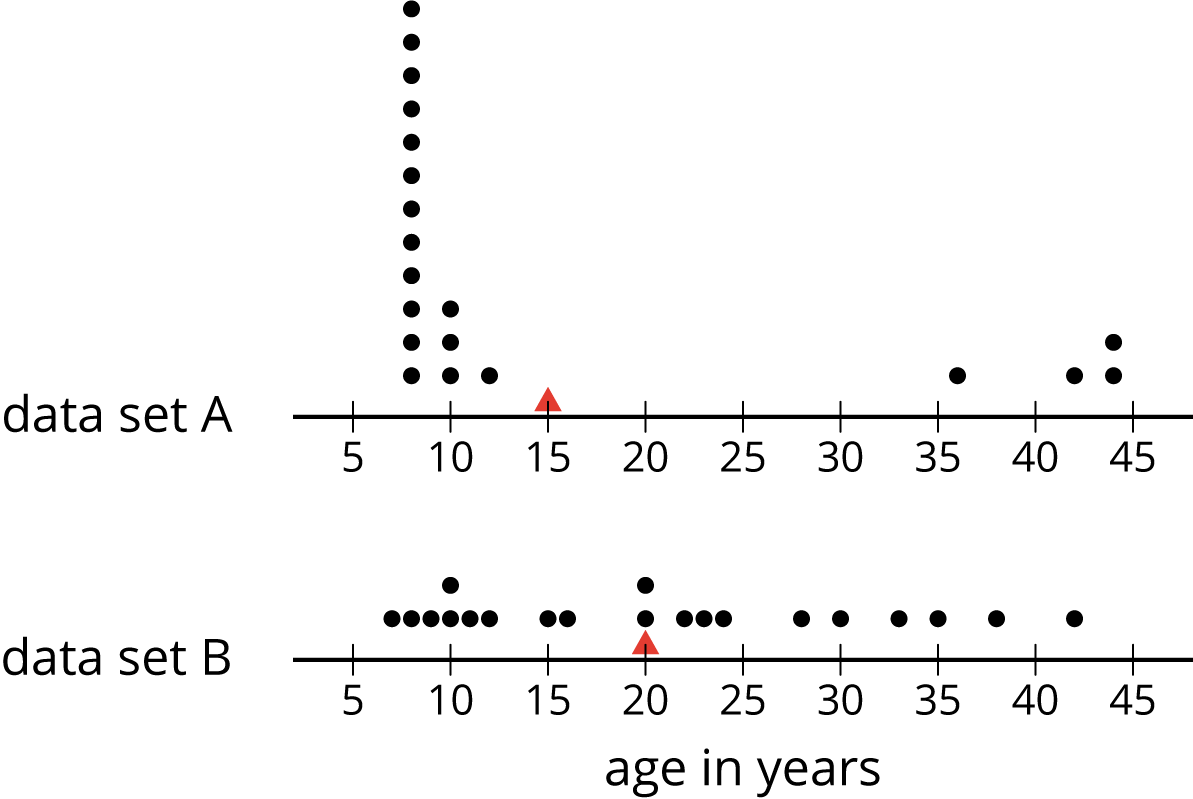
What do you notice and wonder about the distributions in the two dot plots?
Let's look at other measures for describing distributions.
Here are two dot plots including the mean marked with a triangle. Each shows the ages of partygoers at a party.
Here are the ages of a group of the 20 partygoers you saw earlier, shown in order from least to greatest.
| 7 | 8 | 9 | 10 | 10 | 11 | 12 | 15 | 16 | 20 | 20 | 22 | 23 | 24 | 28 | 30 | 33 | 35 | 38 | 42 |
Find and mark the median on the table, and label it “50th percentile.” The data is now partitioned into an upper half and a lower half.
Find and mark the middle value of the lower half of the data, excluding the median. If there is an even number of values, find and write down the average of the middle two. Label this value “25th percentile.”
Find and mark the middle value of the upper half of the data, excluding the median. If there is an even number of values, find and write down the average of the middle two. Label the value “75th percentile.”
You have now partitioned the data set into four pieces. Each of the three values that “cut” the data is called a quartile.
Label the least value in the set “minimum” and the greatest value “maximum.”
Record the five values that you have just identified. They are the five-number summary of the data.
Minimum: _____ Q1: _____ Q2: _____ Q3: _____ Maximum: _____
The median (or Q2) value of this data set is 20. This tells us that half of the partygoers are 20 or younger, and that the other half are 20 or older. What does each of the following values tell us about the ages of the partygoers?
Here is the five-number summary of the age distribution at another party of 21 people.
Minimum: 5 years Q1: 6 years Q2: 27 years Q3: 32 years Maximum: 60 years
Here is a dot plot you saw in an earlier task. It shows how long Elena’s bus rides to school took, in minutes, over 12 days.
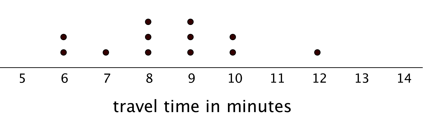
Write the five-number summary for this data set by finding the minimum, Q1, Q2, Q3, and the maximum. Show your reasoning.
The range of a data set is one way to describe the spread of values in a data set. It is the difference between the greatest and least data values. What is the range of Elena’s data?
Another number that is commonly used to describe the spread of values in a data set is the interquartile range (IQR), which is the difference between Q1, the lower quartile, and Q3, the upper quartile.
What is the interquartile range (IQR) of Elena’s data?
What fraction of the data values are between the lower and upper quartiles? Use your answer to complete the following statement:
The interquartile range (IQR) is the length that contains the middle ______ of the values in a data set.
Here are two dot plots that represent two data sets.

Without doing any calculations, predict:
a. Which data set has the smaller IQR? Explain your reasoning.
b. Which data set has the smaller range? Explain your reasoning.
Earlier we learned that the mean is a measure of the center of a distribution and the MAD is a measure of the variability (or spread) that goes with the mean. There is also a measure of spread that goes with the median called the interquartile range (IQR).
Finding the IQR involves partitioning a data set into fourths. Each of the three values that cut the data into fourths is called a quartile.
Here is a set of data with 11 values.
| 12 | 19 | 20 | 21 | 22 | 33 | 34 | 35 | 40 | 40 | 49 |
| Q1 | Q2 | Q3 |
The difference between the minimum and maximum values of a data set is the range.
The difference between Q1 and Q3 is the interquartile range (IQR). Because the distance between Q1 and Q3 includes the middle two-fourths of the distribution, the values between those two quartiles are sometimes called the middle half of the data.
The bigger the IQR, the more spread out the middle half of the data are. The smaller the IQR, the closer the middle half of the data are. We consider the IQR a measure of spread for this reason.
The five numbers in this example are 12, 20, 33, 40, and 49. Their locations are marked with diamonds in the following dot plot.
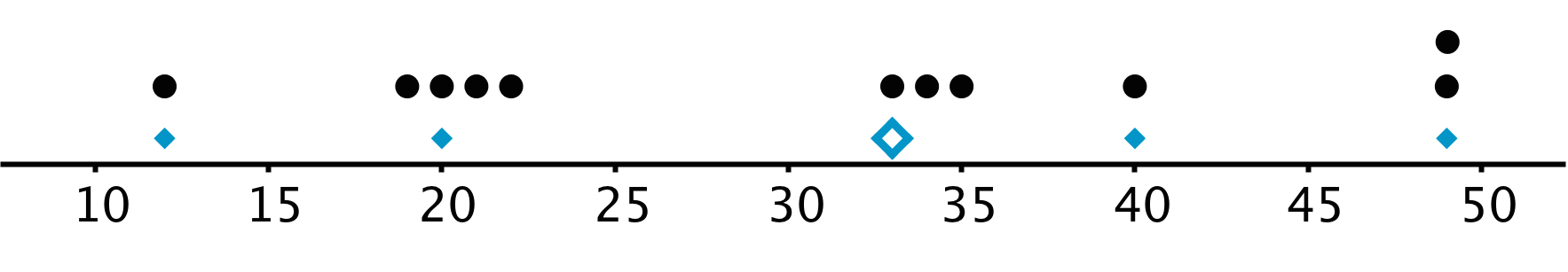
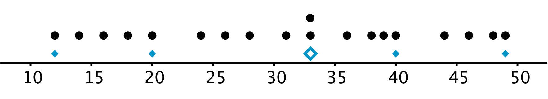
Different data sets could have the same five-number summary. For instance, the following data has the same maximum, minimum, and quartiles as the one above.
The range of a data set is the difference between the maximum and the minimum.
The interquartile range of a data set is a measure of spread of its distribution. It is the difference between the third quartile (Q3) and the first quartile (Q1).
The quartiles for a data set are three numbers that divide the data set into fourths. The median divides the set into two halves, and the first quartile (Q1) is the median of the lower half. The second quartile (Q2) is the median itself, and the third quartile (Q3) is the median of the upper half.