Lesson 17: More about Sampling Variability

Let’s compare samples from the same population.

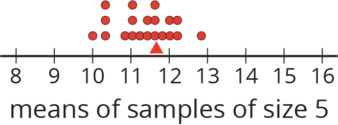
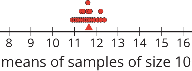
17.1: Average Reactions

The other day, you worked with the reaction times of twelfth graders to see if they were fast enough to help out at the track meet. Look back at the sample you collected.

  1. Calculate the mean reaction time for your sample.
  2. Did you and your partner get the same sample mean? Explain why or why not.

17.2: Reaction Population

Your teacher will display a blank dot plot.

  1. Plot your sample mean from the previous activity on your teacher's dot plot.
  2. What do you notice about the distribution of the sample means from the class?

    1. Where is the center?
    2. Is there a lot of variability?
    3. Is it approximately symmetric?
  3. The population mean is 0.442 seconds. How does this value compare to the sample means from the class?

Pause here so your teacher can display a dot plot of the population of reaction times.

  1. What do you notice about the distribution of the population?

    1. Where is the center?
    2. Is there a lot of variability?
    3. Is it approximately symmetric?
  2. Compare the two displayed dot plots.
  3. Based on the distribution of sample means from the class, do you think the mean of a random sample of 20 items is likely to be:

    1. within 0.01 seconds of the actual population mean?
    2. within 0.1 seconds of the actual population mean?

    Explain or show your reasoning.

17.3: How Much Do You Trust the Answer?

The other day you worked with 2 different samples of viewers from each of 3 different television shows. Each sample included 10 viewers. Here are the mean ages for 100 different samples of viewers from each show.

A dot plot for “sample means for Trivia the Game Show” with the numbers 40 through 70, in increments of 2, is indicated. The data are as follows:  44 years old, 2 dots. 44 point 5 years old, 1 dot. 47 years old, 2 dots. 48 years old, 1 dot. 50 point 5 years old, 1 dot. 51 years old, 1 dot. 52 years old, 4 dots. 52 point 5 years old, 4 dots. 53 years old, 3 dots. 54 years old, 1 dot. 54 point 5 years old, 2 dots. 55 years old, 2 dots. 55 point 5 years old, 3 dots. 56 years old, 6 dots. 56 point 5 years old, 2 dots. 57 years old, 6 dots. 57 point 5 years old, 1 dot. 58 years old, 6 dots. 58 point 5 years old, 7 dots. 59 years old, 9 dots. 59 point 5 years old, 2 dots. 60 years old, 4 dots. 60 point 5 years old, 2 dots. 61 years old, 4 dots. 61 point 5 years old, 3 dots. 62 years old, 2 dots. 63 years old, 3 dots. 63 point 5 years old, 1 dot. 64 years old, 1 dot. 64 point 5 years old, 2 dots. 65 years old, 1 dot. 65 point 5 years old, 1 dot. 66 years old, 2 dots. 66 point 5 years old, 1 dot. 67 point 5 years old, 1 dot. 68 years old, 1 dot.
A dot plot for “sample means for Science Experiments YOU Can Do” with the numbers 9 through 14, in increments of zero point 5, indicated. The data are as follows: 9 point 8 years old, 1 dot. 10 point 2 years old, 1 dot. 10 point 3 years old, 1 dot. 10 point 4 years old, 1 dot. 10 point 6 years old, 1 dot. 10 point 7 years old, 2 dots. 10 point 8 years old, 1 dot. 10 point 9 years old, 3 dots. 11 years old, 1 dot. 11 point 1 years old, 1 dot. 11 point 2 years old, 2 dots. 11 point 3 years old, 1 dot. 11 point 4 years old, 3 dots. 11 point 5 years old, 1 dot. 11 point 6 years old, 5 dots. 11 point 7 years old, 5 dots. 11 point 8 years old, 4 dots. 11 point 9 years old, 8 dots. 12 years old, 6 dots. 12 point 1 years old, 7 dots. 12 point 2 years old, 3 dots. 12 point 3 years old, 4 dots. 12 point 4 years old, 9 dots. 12 point 5 years old, 2 dots. 12 point 6 years old, 8 dots. 12 point 7 years old, 3 dots. 12 point 8 years old, 3 dots. 12 point 9 years old, 5 dots. 13 years old, 1 dot. 13 point 1 years old, 1 dot. 13 point 3 years old, 1 dot. 13 point 4 years old, 1 dot. 13 point 5 years old, 1 dot. 13 point 6 years old, 1 dot. 13 point 8 years old, 2 dots.
A dot plot for “sample means for Learning to Read” with the numbers 5 through 7, in increments of zero point 2, indicated. The data are as follows:  5 years old, 1 dot. 5 point 1 years old, 1 dot. 5 point 2 years old, 1 dot. 5 point 3 years old, 4 dots. 5 point 4 years old, 4 dots. 5 point 5 years old, 6 dots. 5 point 6 years old, 8 dots. 5 point 7 years old, 5 dots. 5 point 8 years old, 10 dots. 5 point 9 years old, 10 dots. 6 years old, 10 dots. 6 point 1 years old, 10 dots. 6 point 2 years old, 9 dots. 6 point 3 years old, 4 dots. 6 point 4 years old, 8 dots. 6 point 5 years old, 4 dots. 6 point 6 years old, 2 dots. 6 point 7 years old, 2 dots. 6 point 8 years old, 1 dot.
  1. For each show, use the dot plot to estimate the population mean.

    1. Trivia the Game Show

    2. Science Experiments YOU Can Do

    3. Learning to Read

  2. For each show, are most of the sample means within 1 year of your estimated population mean?
  3. Suppose you take a new random sample of 10 viewers for each of the 3 shows. Which show do you expect to have the new sample mean closest to the population mean? Explain or show your reasoning.

Summary

This dot plot shows the weights, in grams, of 18 cookies. The triangle indicates the mean weight, which is 11.6 grams.

A dot plot labeled “cookie weights in grams.” The numbers 8 through 16 are indicated. A triangle at approximately 11.6 is indicated. The data are as follows: 8 grams, 1 dot; 9 grams, 1 dot; 10 grams, 2 dots; 11 grams, 2 dots; 12 grams, 4 dots; 13 grams, 3 dots; 14 grams, 3 dots; 15 grams, 1 dot.

This dot plot shows the means of 20 samples of 5 cookies, selected at random. Again, the triangle shows the mean for the population of cookies. Notice that most of the sample means are fairly close to the mean of the entire population.

A dot plot for "means of samples of size 5" with the numbers 8 through 16 indicated. The data are as follows: 10, 1 dot. 10 point 3, 3 dots. 10 point 9, 1 dot. 11, 3 dots. 11 point 2, 1 dot. 11 point 4, 2 dots. 11 point 6, 3 dots. 11 point 8, 1 dot. 12, 2 dots. 12 point 2, 2 dots. 12 point 8, 1 dot. There is a triangle located at 11.6.

This dot plot shows the means of 20 samples of 10 cookies, selected at random. Notice that the means for these samples are even closer to the mean for the entire population.

A dot plot labeled “means of samples of size 10.” The numbers 8 through 16 are indicated. The data are as follows:  10 point 9, 1 dot. 11, 1 dot. 11 point 1, 1 dot. 11 point 2, 1 dot. 11 point 3, 2 dots. 11 point 4, 2 dots. 11 point 5, 1 dot. 11 point 6, 3 dots. 11 point 7, 2 dots. 11 point 8, 1 dot. 11 point 9, 1 dot. 12 point 1, 1 dot. 12 point 3, 2 dots. 12 point 5, 1 dot. A triangle is located at 11 point 6.

In general, as the sample size gets bigger, the mean of a sample is more likely to be closer to the mean of the population.

Practice Problems ▶