5.1: Which One Doesn’t Belong: Scatter Plots
Which one doesn’t belong?
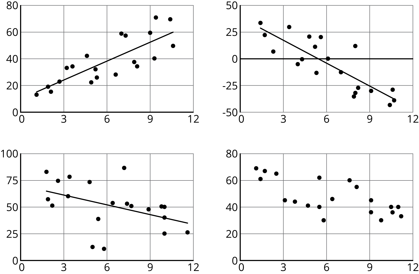
Let’s look for associations between variables.
Which one doesn’t belong?
Experiment with finding lines to fit the data. Drag the points to move the line. You can close the expressions list by clicking on the double arrow.
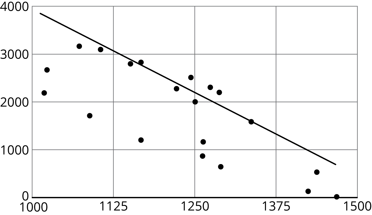
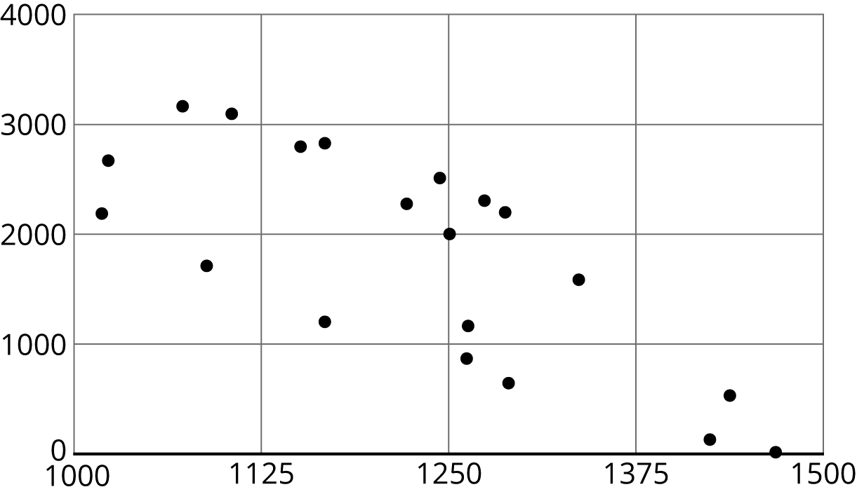
The scatter plots both show the year and price for the same 17 used cars. However, each scatter plot shows a different model for the relationship between year and price.

For how many cars does the model in Diagram A make a good prediction of its price?
For how many cars does the model underestimate the price?
For how many cars does it overestimate the price?
For how many cars does the model in Diagram B make a good prediction of its price?
For how many cars does the model underestimate the price?
For how many cars does it overestimate the price?
For how many cars does the prediction made by the model in Diagram A differ by more than \$3,000? What about the model in Diagram B?
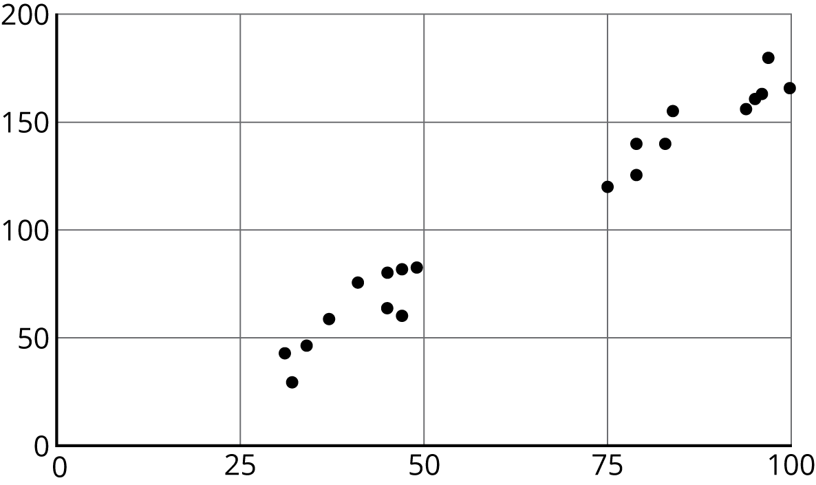


These scatter plots were created by multiplying the $x$-coordinate by 3 then adding a random number between two values to get the $y$-coordinate. The first scatter plot added a random number between -0.5 and 0.5 to the $y$-coordinate. The second scatter plot added a random number between -2 and 2 to the $y$-coordinate. The third scatter plot added a random number between -10 and 10 to the $y$-coordinate.
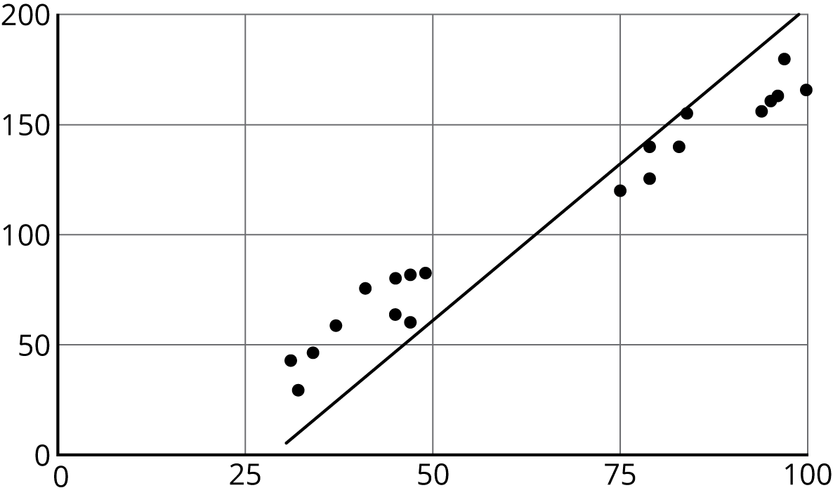
When a linear function fits data well, we say there is a linear association between the variables. For example, the relationship between height and weight for 25 dogs with the linear function whose graph is shown in the scatter plot.
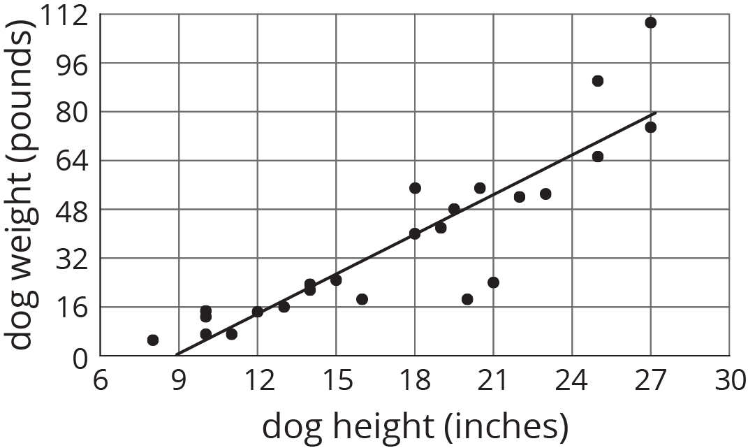
Because the model fits the data well and because the slope of the line is positive, we say that there is a positive association between dog height and dog weight.
What do you think the association between the weight of a car and its fuel efficiency is?
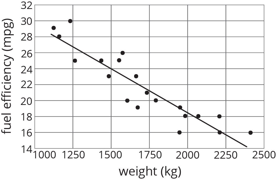
Because the slope of a line that fits the data well is negative, we say that there is a negative association between the fuel efficiency and weight of a car.
See association.
See association.