9.1: Notice and Wonder: Bar Association
What do you notice? What do you wonder?
Let’s look for associations in data.
What do you notice? What do you wonder?
Your teacher will hand out some cards.
Some cards show two-way tables like this:
| has cell phone | does not have cell phone | total | |
|---|---|---|---|
| 10 to 12 years old | 25 | 35 | 60 |
| 13 to 15 years old | 40 | 10 | 50 |
| 16 to 18 years old | 50 | 10 | 60 |
| total | 115 | 55 | 170 |
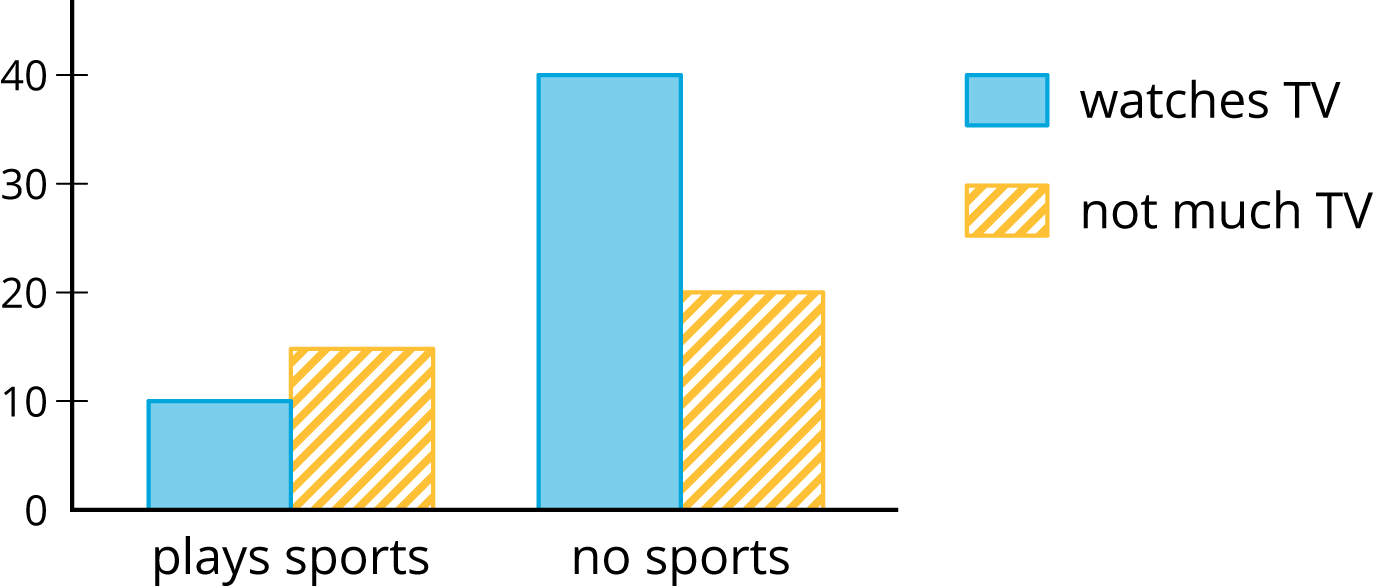
Some cards show bar graphs like this:
Some cards show segmented bar graphs like this:
The bar graphs and segmented bar graphs have their labels removed.
Put all the cards that describe the same situation in the same group.
One of the groups does not have a two-way table. Make a two-way table for the situation described by the graphs in the group.
Label the bar graphs and segmented bar graphs so that the categories represented by each bar are indicated.
Describe in your own words the kind of information shown by a segmented bar graph.
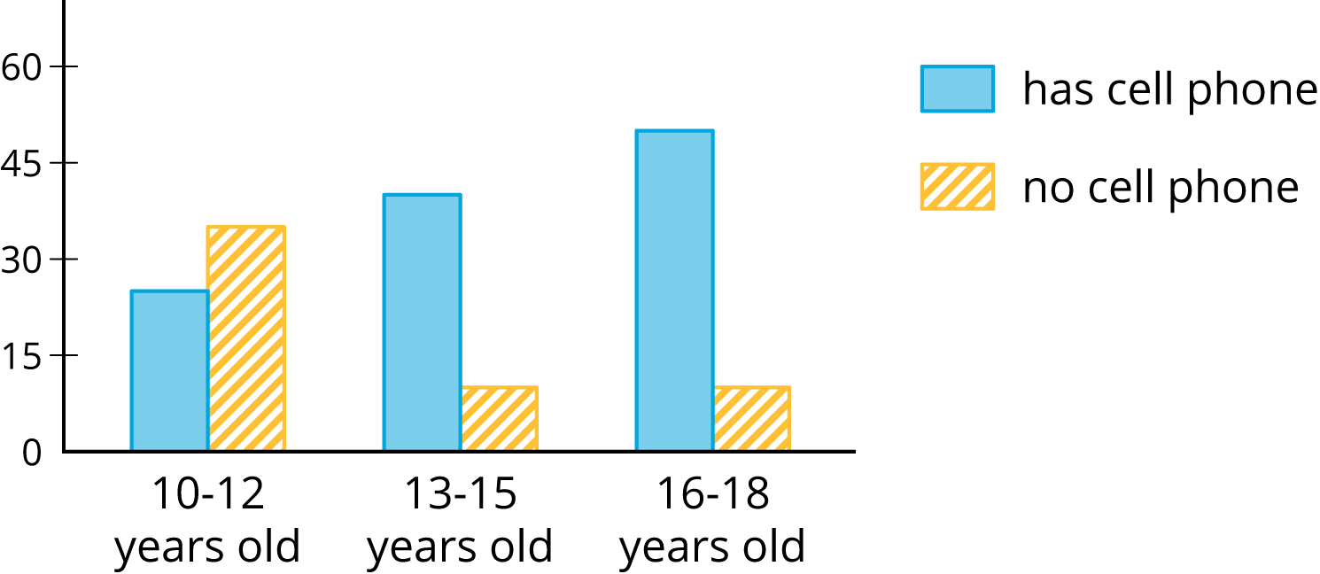
Here is a two-way table that shows data about cell phone usage among children aged 10 to 18.
| has cell phone | does not have cell phone | total | |
|---|---|---|---|
| 10 to 12 years old | 25 | 35 | 60 |
| 13 to 15 years old | 40 | 10 | 50 |
| 16 to 18 years old | 50 | 10 | 60 |
| total | 115 | 55 | 170 |
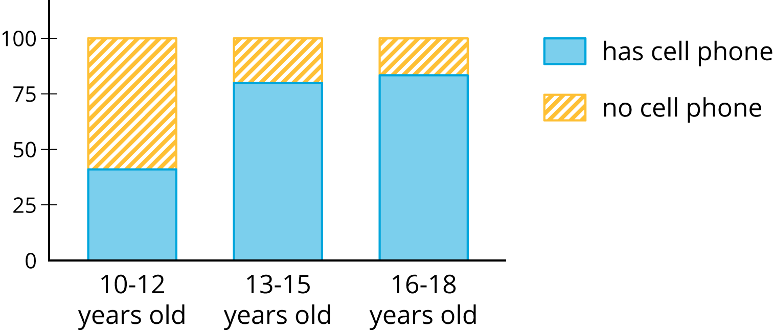
Complete the table. In each row, the entries for “has cell phone” and “does not have cell phone” should have the total 100%. Round entries to the nearest percentage point.
| has cell phone | does not have cell phone | total | |
|---|---|---|---|
| 10 to 12 years old | 42% | ||
| 13 to 15 years old | 100% | ||
| 16 to 18 years old | 17% |
This is still a two-way table. Instead of showing frequency, this table shows relative frequency.
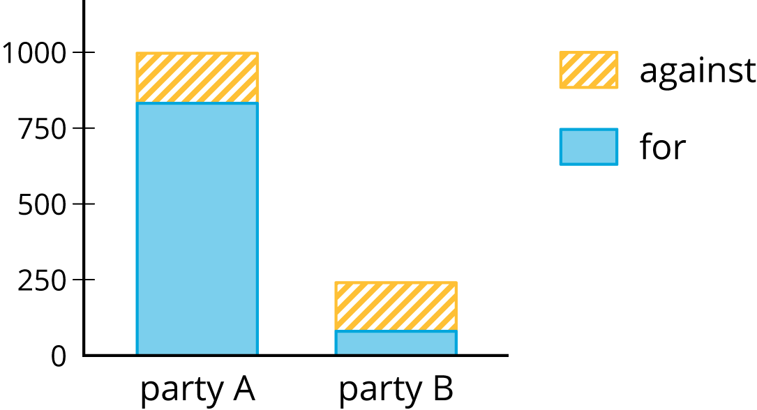
A pollster attends a rally and surveys many of the participants about whether they associate with political Party A or political Party B and whether they are for or against Proposition 3.14 going up for vote soon. The results are sorted into the table shown.
| for | against | |
|---|---|---|
| party A | 832 | 165 |
| party B | 80 | 160 |
When we collect data by counting things in various categories, like red, blue, or yellow, we call the data categorical data, and we say that color is a categorical variable.
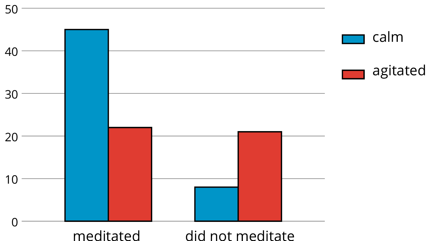
We can use two-way tables to investigate possible connections between two categorical variables. For example, this two-way table of frequencies shows the results of a study of meditation and state of mind of athletes before a track meet.
| meditated | did not meditate | total | |
|---|---|---|---|
| calm | 45 | 8 | 53 |
| agitated | 23 | 21 | 44 |
| total | 68 | 29 | 97 |
If we are interested in the question of whether there is an association between meditating and being calm, we might present the frequencies in a bar graph, grouping data about meditators and grouping data about non-meditators, so we can compare the numbers of calm and agitated athletes in each group.
If we want to know the proportions of calm meditators and calm non-meditators, we can make a two-way table of relative frequencies and present the relative frequencies in a segmented bar graph.
| meditated | did not meditate | |
|---|---|---|
| calm | 66% | 28% |
| agitated | 34% | 72% |
| total | 100% | 100% |
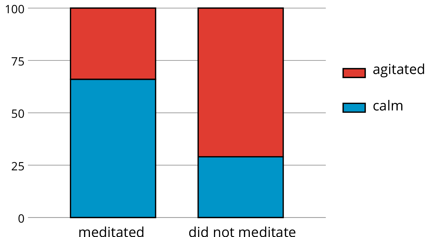
A segmented bar graph compares two categorical variables by showing one of the categories on the horizontal axis and representing the percentages in the other category with stacked vertical bars.
See frequency.
A two-way table provides a way to investigate the connection between two categorical variables.
It shows one of the variables across the top and the other down the side. Each entry in the table is the frequency or relative frequency for the corresponding pair of categories.
The two-way table shows the results of a study of the connection between meditation and state of mind of athletes before a track meet.
| meditated | did not meditate | total | |
|---|---|---|---|
| calm | 45 | 8 | 53 |
| agitated | 23 | 21 | 44 |
| total | 68 | 29 | 97 |