| year | number of cases | |
|---|---|---|
| row 1 | 1941 | 222,202 |
| row 2 | 1950 | 120,718 |
| row 3 | 1945 | 133,792 |
| row 4 | 1942 | 191,383 |
| row 5 | 1953 | 37,129 |
| row 6 | 1939 | 103,188 |
| row 7 | 1951 | 68,687 |
| row 8 | 1948 | 74,715 |
| row 9 | 1955 | 62,786 |
| row 10 | 1952 | 45,030 |
| row 11 | 1940 | 183,866 |
| row 12 | 1954 | 60,866 |
| row 13 | 1944 | 109,873 |
| row 14 | 1946 | 109,860 |
| row 15 | 1943 | 191,890 |
| row 16 | 1949 | 69,479 |
| row 17 | 1947 | 156,517 |
Unit 6: Practice Problem Sets
Lesson 1
Problem 1
Here is data on the number of cases of whooping cough from 1939 to 1955.
- Make a new table that orders the data by year.
- Which years in this period of time had fewer than 100,000 cases of whooping cough?
- Based on this data, would you expect 1956 to have closer to 50,000 cases or closer to 100,000 cases?
Problem 2
In volleyball statistics, a block is recorded when a player deflects the ball hit from the opposing team. Additionally, scorekeepers often keep track of the average number of blocks a player records in a game. Here is part of a table that records the number of blocks and blocks per game for each player in a women’s volleyball tournament. A scatter plot that goes with the table follows.
| blocks | blocks per game | |
|---|---|---|
| row 1 | 13 | 1.18 |
| row 2 | 1 | 0.17 |
| row 3 | 5 | 0.42 |
| row 4 | 0 | 0 |
| row 5 | 0 | 0 |
| row 6 | 7 | 0.64 |
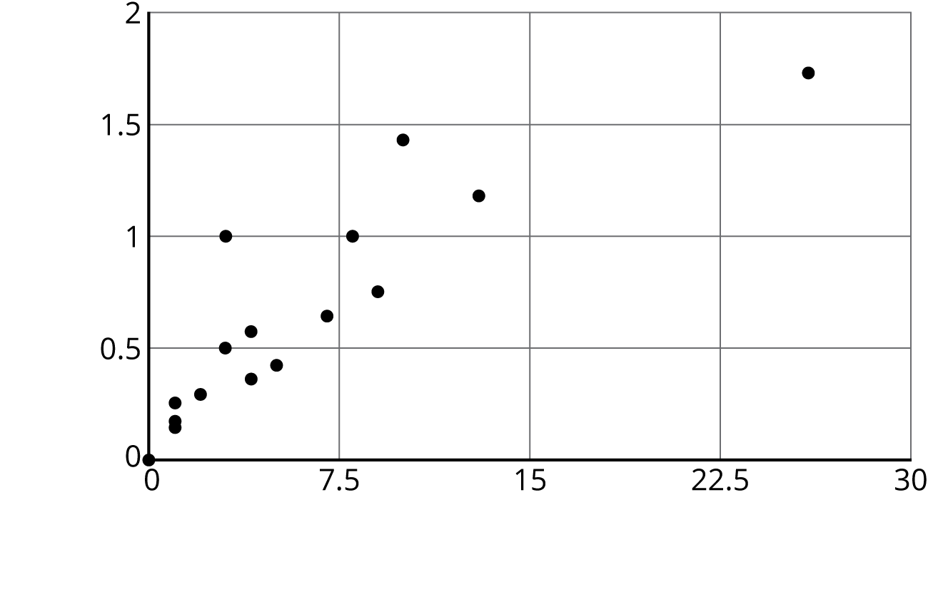
Label the axes of the scatter plot with the necessary information.
Problem 3 (from Unit 5, Lesson 18)
A cylinder has a radius of 4 cm and a height of 5 cm.
- What is the volume of the cylinder?
- What is the volume of the cylinder when its radius is tripled?
- What is the volume of the cylinder when its radius is halved?
Lesson 2
Problem 1
In hockey, a player gets credited with a “point” in their statistics when they get an assist or goal. The table shows the number of assists and number of points for 15 hockey players after a season.
| assists | points | |
|---|---|---|
| row 1 | 22 | 28 |
| row 2 | 16 | 18 |
| row 3 | 46 | 72 |
| row 4 | 19 | 29 |
| row 5 | 13 | 26 |
| row 6 | 9 | 13 |
| row 7 | 16 | 22 |
| row 8 | 8 | 18 |
| row 9 | 12 | 13 |
| row 10 | 12 | 17 |
| row 11 | 37 | 50 |
| row 12 | 7 | 12 |
| row 13 | 17 | 34 |
| row 14 | 27 | 58 |
| row 15 | 18 | 34 |
Make a scatter plot of this data. Make sure to scale and label the axes.
Problem 2
Select all the representations that are appropriate for comparing bite strength to weight for different carnivores.
- Histogram
- Scatter plot
- Dot plot
- Table
- Box plot
Problem 3
When is it better to use a table? When is it better to use a scatter plot?
Problem 4 (from Unit 5, Lesson 17)
There are many cylinders with radius 6 meters. Let $h$ represent the height in meters and $V$ represent the volume in cubic meters.
-
Write an equation that represents the volume $V$ as a function of the height $h$.
-
Sketch the graph of the function, using 3.14 as an approximation for $\pi$.
-
If you double the height of a cylinder, what happens to the volume? Explain this using the equation.
-
If you multiply the height of a cylinder by $\frac 1 3$, what happens to the volume? Explain this using the graph.
Lesson 3
Problem 1
Here is a table and a scatter plot that compares points per game to free throw attempts for a basketball team during a tournament.
| player | free throw attempts | points |
|---|---|---|
| player A | 5.5 | 28.3 |
| player B | 2.1 | 18.6 |
| player C | 4.1 | 13.7 |
| player D | 1.6 | 10.6 |
| player E | 3.1 | 10.4 |
| player F | 1 | 5 |
| player G | 1.2 | 5 |
| player H | 0.7 | 4.7 |
| player I | 1.5 | 3.7 |
| player J | 1.5 | 3.5 |
| player K | 1.2 | 3.1 |
| player L | 0 | 1 |
| player M | 0 | 0.8 |
| player N | 0 | 0.6 |
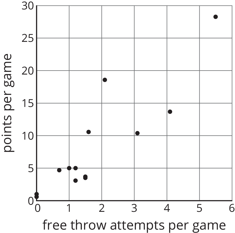
- Circle the point that represents the data for Player E.
- What does the point $(2.1,18.6)$ represent?
- In that same tournament, Player O on another team scored 14.3 points per game with 4.8 free throw attempts per game. Plot a point on the graph that shows this information.
Problem 2 (from Unit 6, Lesson 2)
Select all the representations that are appropriate for comparing exam score to number of hours of sleep the night before the exam.
- Histogram
- Scatter plot
- Dot plot
- Table
- Box plot
Problem 3 (from Unit 5, Lesson 17)
A cone has a volume of $36\pi$ cm3 and height $h$. Complete this table for volume of cylinders with the same radius but different heights.
| height (cm) | volume (cm3) | |
|---|---|---|
| row 1 | $h$ | $36\pi$ |
| row 2 | $2h$ | |
| row 3 | $5h$ | |
| row 4 | $\frac h2$ | |
| row 5 | $\frac h5$ |
Lesson 4
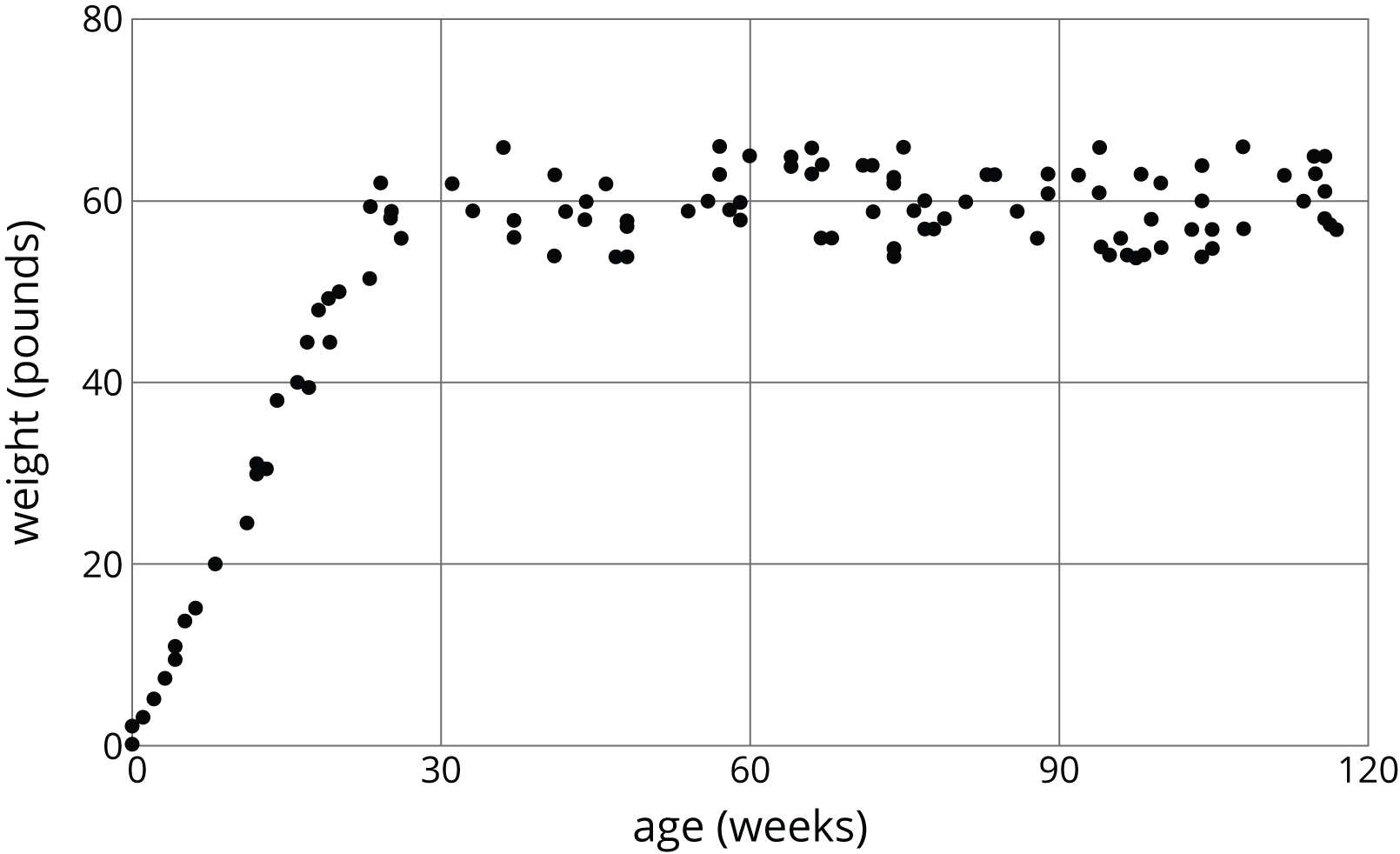
Problem 1
The scatter plot shows the number of hits and home runs for 20 baseball players who had at least 10 hits last season. The table shows the values for 15 of those players.
The model, represented by $y = 0.15x - 1.5$, is graphed with a scatter plot.
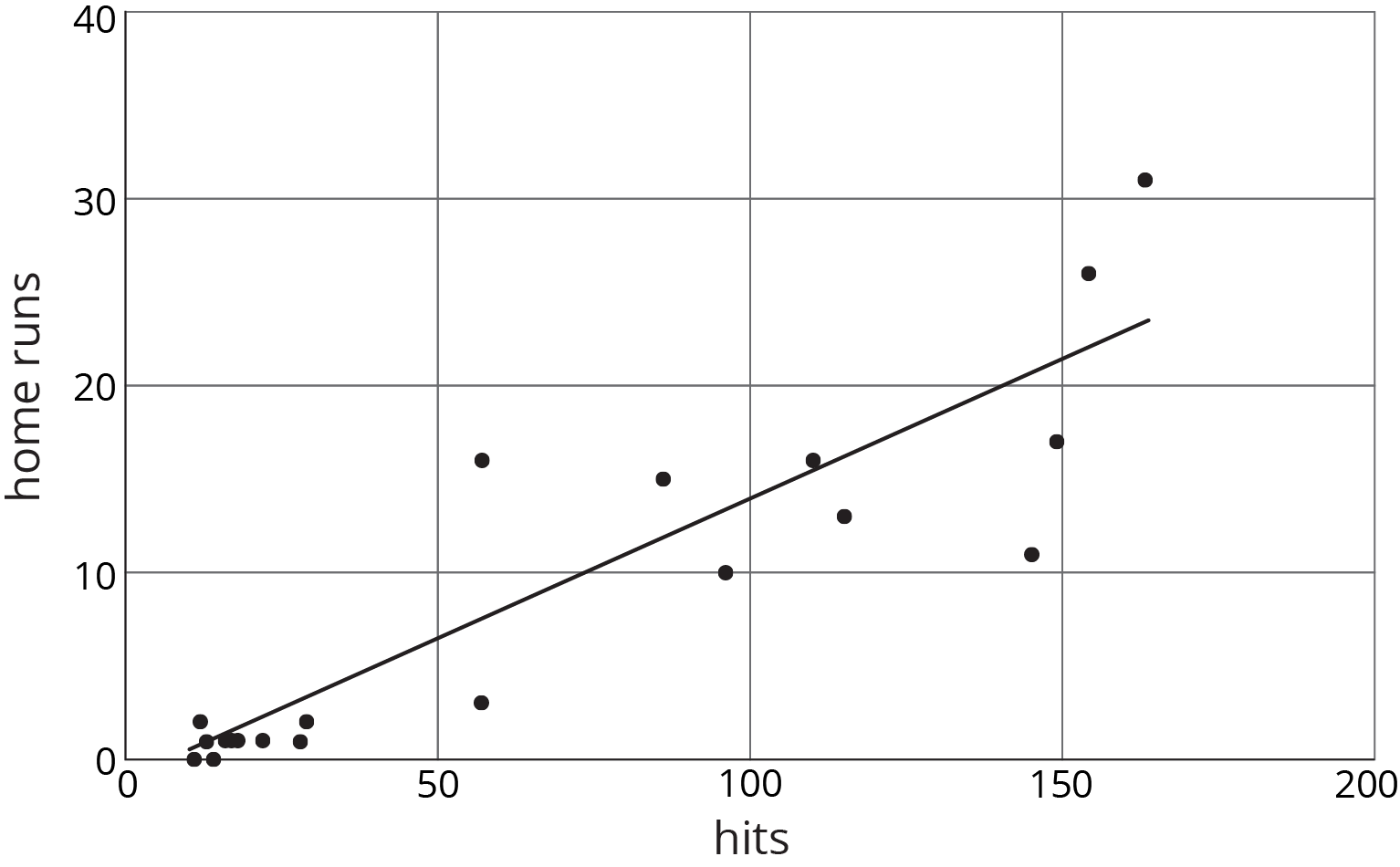
Use the graph and the table to answer the questions.
- Player A had 154 hits in 2015. How many home runs did he have? How many was he predicted to have?
- Player B was the player who most outperformed the prediction. How many hits did Player B have last season?
- What would you expect to see in the graph for a player who hit many fewer home runs than the model predicted?
| hits | home runs | predicted home runs | |
|---|---|---|---|
| row 1 | 12 | 2 | 0.3 |
| row 2 | 22 | 1 | 1.8 |
| row 3 | 154 | 26 | 21.6 |
| row 4 | 145 | 11 | 20.3 |
| row 5 | 110 | 16 | 15 |
| row 6 | 57 | 3 | 7.1 |
| row 7 | 149 | 17 | 20.9 |
| row 8 | 29 | 2 | 2.9 |
| row 9 | 13 | 1 | 0.5 |
| row 10 | 18 | 1 | 1.2 |
| row 11 | 86 | 15 | 11.4 |
| row 12 | 163 | 31 | 23 |
| row 13 | 115 | 13 | 15.8 |
| row 14 | 57 | 16 | 7.1 |
| row 15 | 96 | 10 | 12.9 |
Problem 2
Here is a scatter plot that compares points per game to free throw attempts per game for basketball players in a tournament. The model, represented by $y = 4.413x + 0.377$, is graphed with the scatter plot. Here, $x$ represents free throw attempts per game, and $y$ represents points per game.
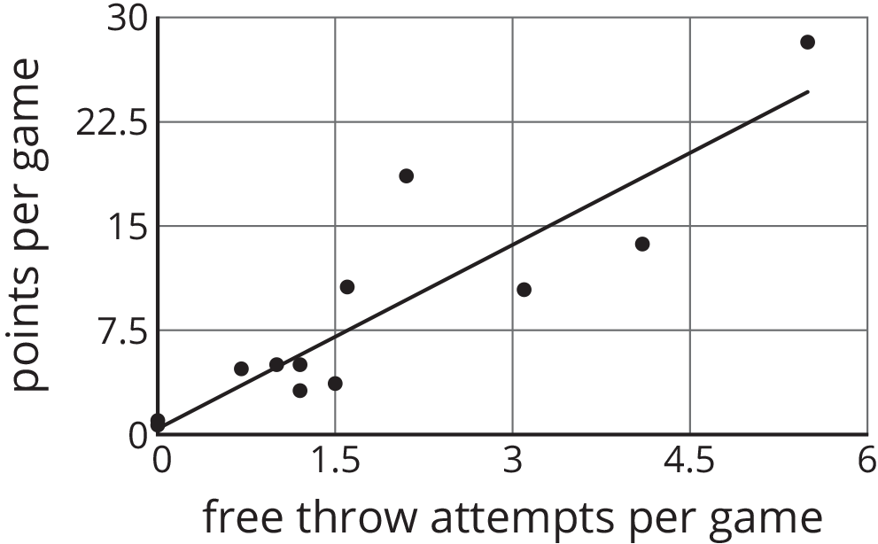
- Circle any data points that appear to be outliers.
- What does it mean for a point to be far above the line in this situation?
- Based on the model, how many points per game would you expect a player who attempts 4.5 free throws per game to have? Round your answer to the nearest tenth of a point per game.
- One of the players scored 13.7 points per game with 4.1 free throw attempts per game. How does this compare to what the model predicts for this player?
Lesson 5
Problem 1
- Draw a line that you think is a good fit for this data. For this data, the inputs are the horizontal values, and the outputs are the vertical values.
- Use your line of fit to estimate what you would expect the output value to be when the input is 10.
Problem 2 (from Unit 6, Lesson 3)
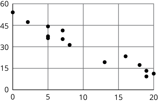
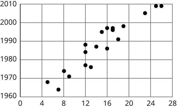
Here is a scatter plot that shows the most popular videos in a 10-year span.
- Use the scatter plot to estimate the number of views for the most popular video in this 10-year span.
- Estimate when the 4th most popular video was released.
Problem 3 (from Unit 5, Lesson 8)
A recipe for bread calls for 1 teaspoon of yeast for every 2 cups of flour.
-
Name two quantities in this situation that are in a functional relationship.
-
Write an equation that represents the function.
-
Draw the graph of the function. Label at least two points with input-output pairs.
Lesson 6
Problem 1
Which of these statements is true about the data in the scatter plot?
- As $x$ increases, $y$ tends to increase.
- As $x$ increases, $y$ tends to decrease.
- As $x$ increases, $y$ tends to stay unchanged.
- $x$ and $y$ are unrelated.
Problem 2
Here is a scatter plot that compares hits to at bats for players on a baseball team.

Describe the relationship between the number of at bats and the number of hits using the data in the scatter plot.
Problem 3
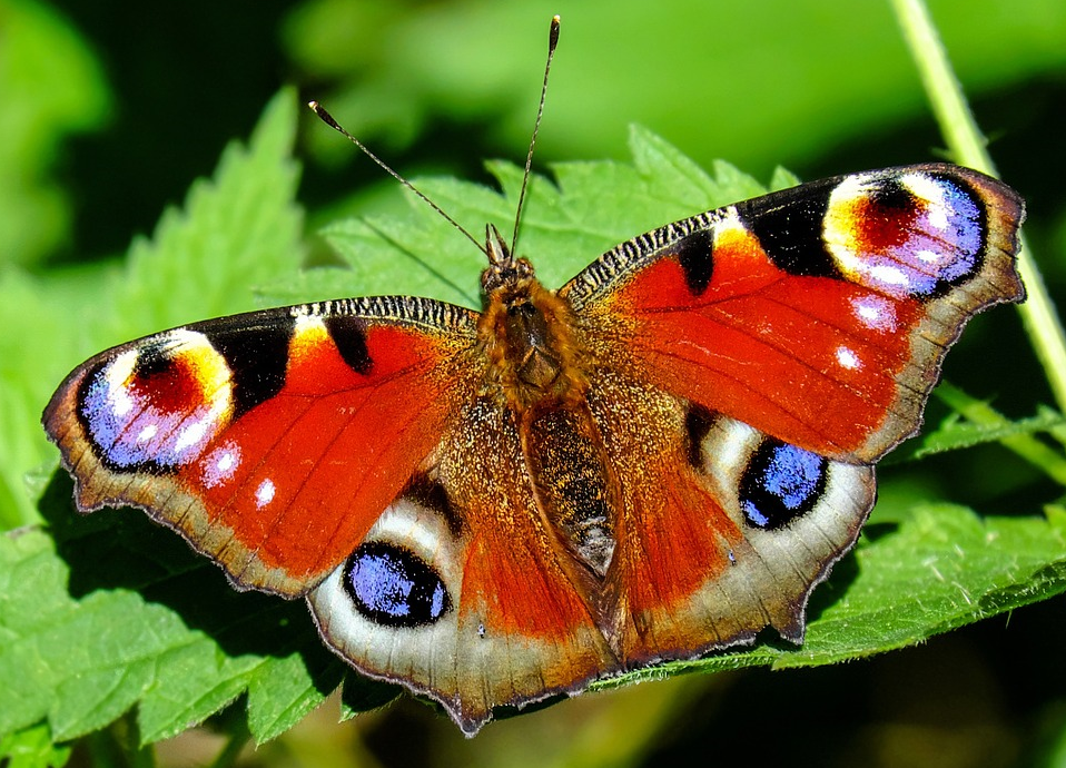
The linear model for some butterfly data is given by the equation $y = 0.238x + 4.642$. Which of the following best describes the slope of the model?
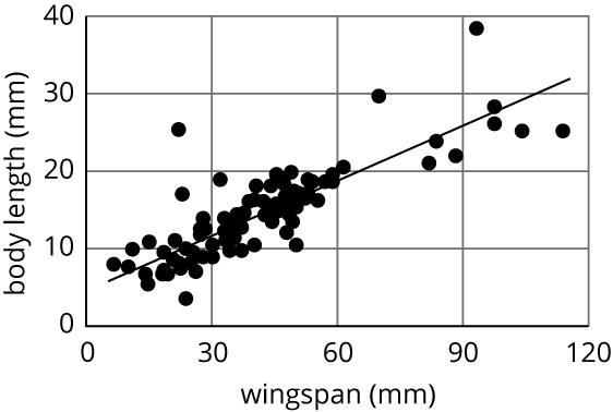
- For every 1 mm the wingspan increases, the length of the butterfly increases 0.238 mm.
- For every 1 mm the wingspan increases, the length of the butterfly increases 4.642 mm.
- For every 1 mm the length of the butterfly increases, the wingspan increases 0.238 mm.
- For every 1 mm the length of the butterfly increases, the wingspan increases 4.642 mm.
Problem 4 (from Unit 6, Lesson 4)
Nonstop, one-way flight times from O’Hare Airport in Chicago and prices of a one-way ticket are shown in the scatter plot.

- Circle any data that appear to be outliers.
- Use the graph to estimate the difference between any outliers and their predicted values.
Problem 5 (from Unit 4, Lesson 14)
Solve: \(\begin{cases} y=\text-3x+13 \\ y=\text-2x+1 \\ \end{cases}\)
Lesson 7
Problem 1
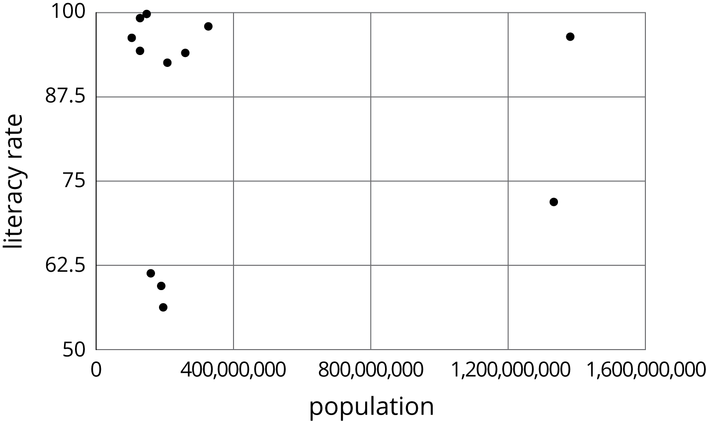
Literacy rate and population for the 12 countries with more than 100 million people are shown in the scatter plot. Circle any clusters in the data.
Problem 2
Here is a scatter plot:
Select all the following that describe the association in the scatter plot:
- Linear association
- Non-linear association
- Positive association
- Negative association
- No association
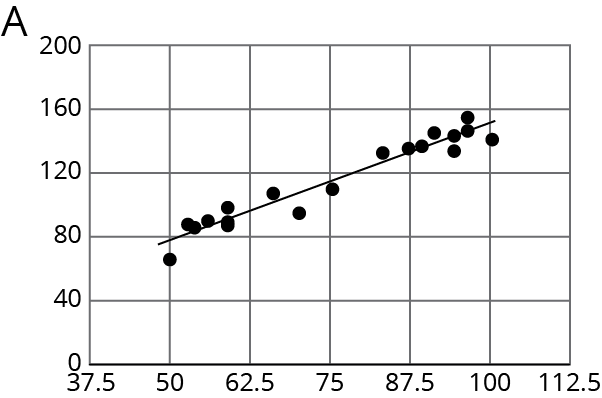
Problem 3 (from Unit 6, Lesson 5)
For the same data, two different models are graphed. Which model more closely matches the data? Explain your reasoning.
Problem 4 (from Unit 6, Lesson 3)
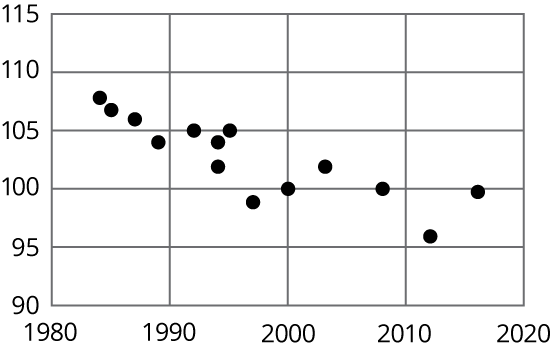
Here is a scatter plot of data for some of the tallest mountains on Earth.
The heights in meters and year of first recorded ascent is shown. Mount Everest is the tallest mountain in this set of data.
- Estimate the height of Mount Everest.
- Estimate the year of the first recorded ascent of Mount Everest.

Problem 5 (from Unit 5, Lesson 18)
A cone has a volume $V$, radius $r$, and a height of 12 cm.
- A cone has the same height and $\frac13$ of the radius of the original cone. Write an expression for its volume.
- A cone has the same height and 3 times the radius of the original cone. Write an expression for its volume.
Lesson 8
Problem 1
Different stores across the country sell a book for different prices. The table shows the price of the book in dollars and the number of books sold at that price.
| price in dollars | number sold | |
|---|---|---|
| row 1 | 11.25 | 53 |
| row 2 | 10.50 | 60 |
| row 3 | 12.10 | 30 |
| row 4 | 8.45 | 81 |
| row 5 | 9.25 | 70 |
| row 6 | 9.75 | 80 |
| row 7 | 7.25 | 120 |
| row 8 | 12 | 37 |
| row 9 | 9.99 | 130 |
| row 10 | 7.99 | 100 |
| row 11 | 8.75 | 90 |
- Draw a scatter plot of this data. Label the axes.
- Are there any outliers? Explain your reasoning.
- If there is a relationship between the variables, explain what it is.
- Remove any outliers, and draw a line that you think is a good fit for the data.
Problem 2 (from Unit 6, Lesson 7)
Here is a scatter plot:
Select all the following that describe the association in the scatter plot:
- Linear association
- Non-linear association
- Positive association
- Negative association
- No association
Problem 3 (from Unit 6, Lesson 6)
Using the data in the scatter plot, what can you tell about the slope of a good model?
- The slope is positive.
- The slope is zero.
- The slope is negative.
- There is no association.
Lesson 9
Problem 1
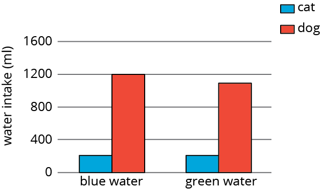
A scientist wants to know if the color of the water affects how much animals drink. The average amount of water each animal drinks was recorded in milliliters for a week and then graphed. Is there evidence to suggest an association between water color and animal?
| cat intake (ml) | dog intake (ml) | total (ml) | |
|---|---|---|---|
| blue water | 210 | 1200 | 1410 |
| green water | 200 | 1100 | 1300 |
| total | 410 | 2300 | 2710 |
Problem 2
A farmer brings his produce to the farmer’s market and records whether people buy lettuce, apples, both, or something else.
| bought apples | did not buy apples | |
|---|---|---|
| bought lettuce | 14 | 58 |
| did not buy lettuce | 8 | 29 |
Make a table that shows the relative frequencies for each row. Use this table to decide if there is an association between buying lettuce and buying apples.
Problem 3
Researchers at a media company want to study news-reading habits among different age groups. They tracked print and online subscription data and made a 2-way table.
| internet articles | print articles | |
|---|---|---|
| 18–25 year olds | 151 | 28 |
| 26–45 year olds | 132 | 72 |
| 45–65 year olds | 48 | 165 |
- Create a segmented bar graph using one bar for each row of the table.
- Is there an association between age groups and the method they use to read articles? Explain your reasoning.
Problem 4 (from Unit 6, Lesson 6)
Using the data in the scatter plot, what is a reasonable slope of a model that fits this data?
- -2.5
- -1
- 1
- 2.5
Lesson 10
Problem 1
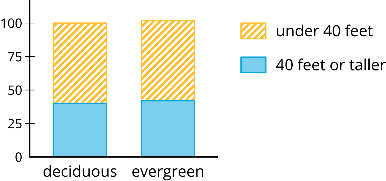
An ecologist is studying a forest with a mixture of tree types. Since the average tree height in the area is 40 feet, he measures the height of the tree against that. He also records the type of tree. The results are shown in the table and segmented bar graph. Is there evidence of an association between tree height and tree type? Explain your reasoning.
| under 40 feet | 40 feet or taller | total | |
|---|---|---|---|
| deciduous | 45 | 30 | 75 |
| evergreen | 14 | 10 | 24 |
| total | 59 | 40 | 99 |
Problem 2
Workers at an advertising agency are interested in people’s TV viewing habits. They take a survey of people in two cities to try to find patterns in the types of shows they watch. The results are recorded in a table and shown in a segmented bar graph. Is there evidence of different viewing habits? If so, explain.
| reality | news | comedy | drama | |
|---|---|---|---|---|
| Chicago | 50 | 40 | 90 | 20 |
| Topeka | 45 | 70 | 40 | 45 |

Problem 3
A scientist is interested in whether certain species of butterflies like certain types of local flowers. The scientist captures butterflies in two zones with different flower types and records the number caught. Do these data show an association between butterfly type and zone? Explain your reasoning.
| zone 1 | zone 2 | |
|---|---|---|
| eastern tiger swallowtail | 16 | 34 |
| monarch | 24 | 46 |
Lesson 11
No practice problems for this lesson.