4.1: Predict This
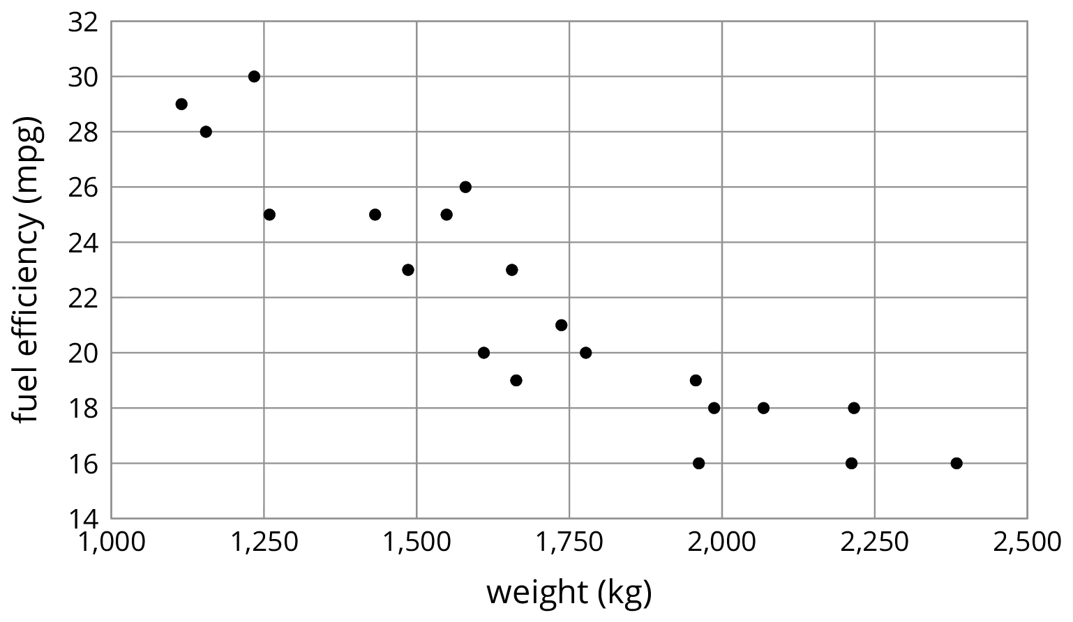
Here is a scatter plot that shows weights and fuel efficiencies of 20 different types of cars.
If a car weighs 1,750 kg, would you expect its fuel efficiency to be closer to 22 mpg or to 28 mpg? Explain your reasoning.
Let’s look at the scatter plots as a whole.
Here is a scatter plot that shows weights and fuel efficiencies of 20 different types of cars.
If a car weighs 1,750 kg, would you expect its fuel efficiency to be closer to 22 mpg or to 28 mpg? Explain your reasoning.
The prices and sizes of 20 different diamonds are shown in the table and scatter plot.
| weight (carats) | actual price (dollars) | predicted price (dollars) | |
|---|---|---|---|
| row 1 | 1 | 3,772 | 4,429 |
| row 2 | 1 | 4,221 | 4,429 |
| row 3 | 1 | 4,032 | 4,429 |
| row 4 | 1 | 5,385 | 4,429 |
| row 5 | 1.05 | 3,942 | 4,705 |
| row 6 | 1.05 | 4,480 | 4,705 |
| row 7 | 1.06 | 4,511 | 4,760 |
| row 8 | 1.2 | 5,544 | 5,533 |
| row 9 | 1.3 | 6,131 | 6,085 |
| row 10 | 1.32 | 5,872 | 6,195 |
| row 11 | 1.41 | 7,122 | 6,692 |
| row 12 | 1.5 | 7,474 | 7,189 |
| row 13 | 1.5 | 5,904 | 7,189 |
| row 14 | 1.59 | 8,706 | 7,686 |
| row 15 | 1.61 | 8,252 | 7,796 |
| row 16 | 1.73 | 9,530 | 8,459 |
| row 17 | 1.77 | 9,374 | 8,679 |
| row 18 | 1.85 | 8,169 | 9,121 |
| row 19 | 1.9 | 9,541 | 9,397 |
| row 20 | 2.04 | 9,125 | 10,170 |
The scatter plot shows the prices and weights of the 20 diamonds together with the graph of $y = 5,\!520x- 1,\!091$.
The function described by the equation $y = 5,\!520x- 1,\!091$ is a model of the relationship between a diamond’s weight and its price.
This model predicts the price of a diamond from its weight. These predicted prices are shown in the third column of the table.
The scatter plot shows widths and lengths of 20 different left feet. Use the double arrows to show or hide the expressions list.
Estimate the widths of the longest foot and the shortest foot.
Estimate the lengths of the widest foot and the narrowest foot.
Click on the gray circle next to the words “The Line” in the expressions list.  The graph of a linear model should appear. Find the data point that seems weird when compared to the model. What length and width does that point represent?
Sometimes, we can use a linear function as a model of the relationship between two variables. For example, here is a scatter plot that shows heights and weights of 25 dogs together with the graph of a linear function which is a model for the relationship between a dog’s height and its weight.
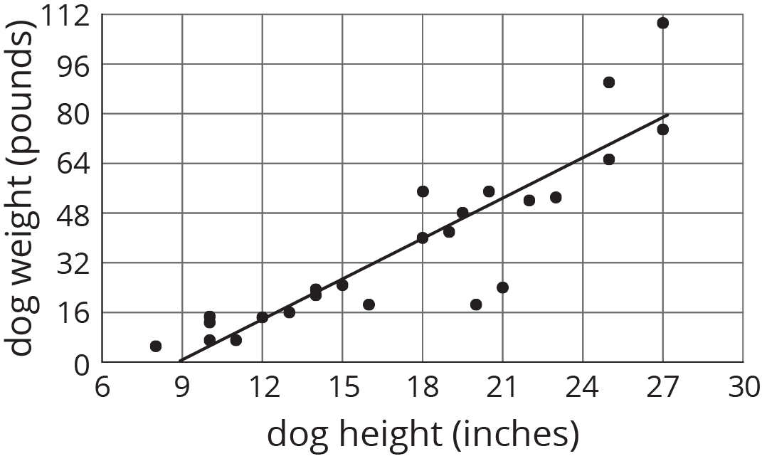
We can see that the model does a good job of predicting the weight given the height for some dogs. These correspond to points on or near the line. The model doesn’t do a very good job of predicting the weight given the height for the dogs whose points are far from the line.
For example, there is a dog that is about 20 inches tall and weighs a little more than 16 pounds. The model predicts that the weight would be about 48 pounds. We say that the model overpredicts the weight of this dog. There is also a dog that is 27 inches tall and weighs about 110 pounds. The model predicts that its weight will be a little less than 80 pounds. We say the model underpredicts the weight of this dog.
Sometimes a data point is far away from the other points or doesn’t fit a trend that all the other points fit. We call these outliers.
In statistics, an outlier is a data value that is way outside the group of other values.